|
In the last issue of the Climate Newsletter you may have read about our blog post on communicating climate science. We discussed how being creative in how we share science can help tell the stories of climate change to a wider audience. Throughout June we have explored this topic further, considering how we can share information and news about climate change in ways which resonate with different people.
 Visualising climate data in creative ways can be a very effective way of bringing information on climate change to life. This can range from representing data graphically, such as in our Climate Dashboard, to design-led approaches. The now famous climate stripes (above) by Professor Ed Hawkins of the University of Reading, are an example of a visualisation which clearly shows how the planet has warmed since 1850. It was these stripes which inspired Met Office scientist Josh Macholl and a team of colleagues during a recent hackathon event. The team produced a similar graphic which included data from a variety of climate models looking ahead to the year 2080.
A similar visualisation was developed as part of the IPCC interactive atlas to highlight the uncertainty in different global regions for climate variables.
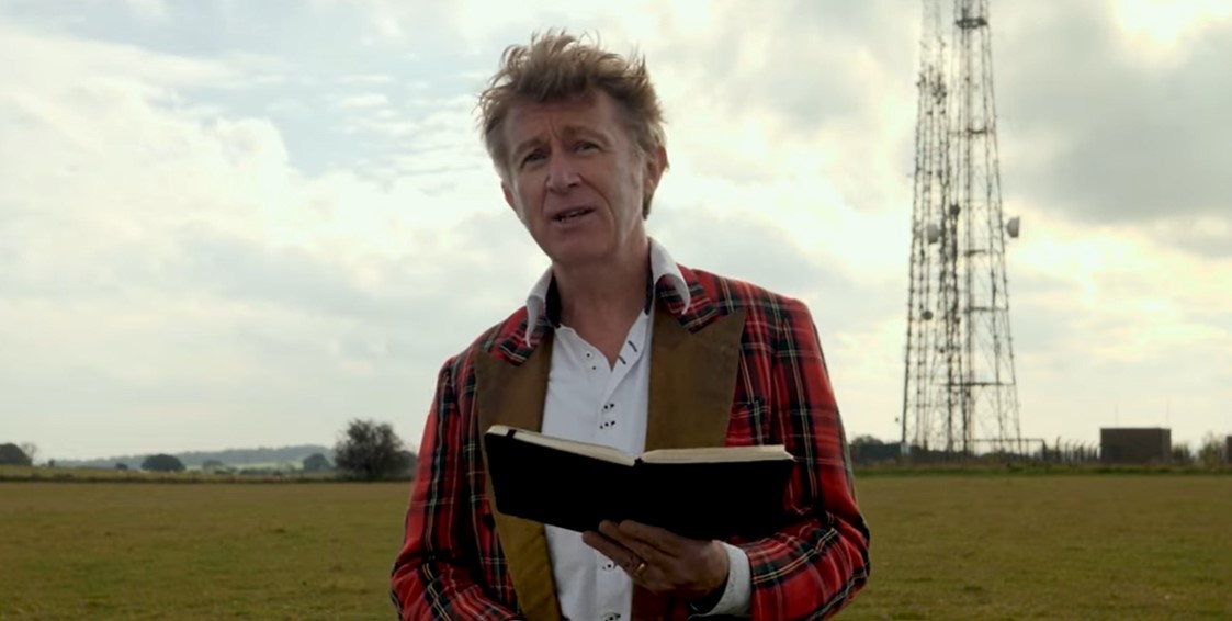 Art can be a very powerful way of getting messages across to people including information on climate science. Ahead of COP26 last year a group of poets worked on a series of climate poems which were then performed and discussed during an event on the COP26 Science Pavilion. Poet Elvis McGonagall collaborated with the Met Office on his poem which highlighted severe weather.
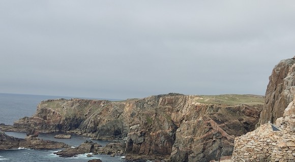
More recently, Met Office scientist Dr James Pope was involved in a project in the Outer Hebrides through which he analysed changes in the frequency of weather patterns which are associated with severe weather that impacts the islands. To raise community awareness of the scientific analysis, the project team worked with a local artist to combine the lived experiences of the community with music created from the UK Climate Projections model data. Three musical pieces were created and shared through a series of events.
An emerging concept in climate science and services literature, storylines approaches are an example of bringing storytelling and narrative elements into the creation of climate data, as well as communicating it. Met Office scientist Chris Goddard has been working on a European Climate Prediction system (EUCP) project which has been exploring the role of storylines.
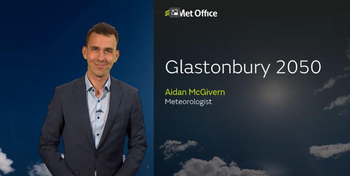 People are used to seeing weather forecasts and taking in information on what the weather will be doing in their area over the coming days. Our 2050 forecast videos share some of the weather conditions we could expect to see in the future. Most recently we have produced a forecast for how the weather could look for the Glastonbury Festival in 30 years’ time. This isn’t a genuine forecast but a plausible weather event for 2050 based on our UK climate projections. In our new blog post we look at how these forecasts are produced and the science behind them.
Listening to stories about the science behind climate change and the people it affects are another way of sharing valuable information about climate science. Met Office Mostly Climate podcast co-host Dr Rosie Oakes has shared her personal reflections on the value of podcasts as a way of sharing climate science. She discusses how she and her colleagues try and break down complex topics to make them more meaningful for a wider audience.
Tomorrow, 30 June, you can listen live to a Twitter Spaces audio conversation on ‘storytelling through data’, hosted by Met Office presenter Alex Deakin. He will be joined at 4pm by Met Office scientists Dr Freya Garry and Dr Rosie Oakes, Met Office geographic information system specialist and visualisation expert Neil Kaye, and Community Energy Scotland’s Matthew Logan at @metoffice. The conversation will also be available afterwards on demand.
|