|
www.coventry.gov.uk/infoandstats
In this issue:
Source: Office for National Statistics
The ONS have published updated population estimate figures for Coventry, for mid-2018. Read a summary of the new figures.
Coventry’s population estimate for mid-2018 was 366,800 residents, an annual increase of 6,600 from mid-2017. As has been the case in recent years, the annual population increase in Coventry was amongst the highest in the UK, Coventry’s growth rate is the 14th highest out of all 381 local authority areas.
The main factor causing population growth in Coventry is international migration. While population growth remains high compared to other areas, growth slowed a little in 2018 compared to last year.
Source: Local Health, Public Health England; Insight, Coventry City Council
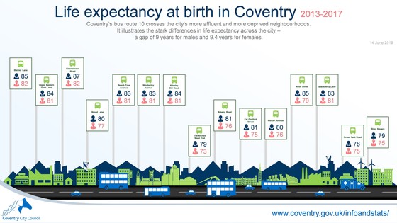 Coventry's bus route 10 crosses the city's more affluent and more deprived neighbourhoods. It illustrates the differences in life expectancy across the city — a gap of 9 years for males and 9.4 years for females across the areas served by the number 10 bus.
Female residents of the Alderminster Road area (Eastern Green) have a life expectancy of 87.2 years whereas those living near Broad Park Road (Wood End & Henley Green) have a life expectancy of 77.8 years. Male residents living near Banner Lane have a life expectancy of 82.4 years compared to those living near The Arches Spon End have a life expectancy of 73.4 years.
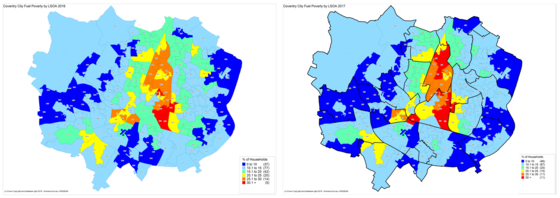 Left: Coventry Fuel Poverty by LSOA 2016; Right: Coventry Fuel Poverty by LSOA 2017
Source: Department for Business, Energy & Industrial Strategy; Insight, Coventry City Council
In June, the Government published 2017 fuel poverty data at sub-regional level.
In 2017 an estimated 14.7% of all Coventry households were in fuel poverty, slightly down from 15.3% in 2016. However, the data shows that the situation worsened in areas that were already struggling with fuel poverty in 2016. Areas that showed improvement in 2017 tend to be those that were previously not too bad.
Looking at the maps above, 2017 shows more dark blue areas (where 0-10% of households are in fuel poverty) than in 2016, and they tend to be in previously light blue areas (where 10% to 15% of households are in fuel poverty). There are also more red areas (where >30% of the households are in fuel poverty) in 2017. They tend to be in areas that were previously orange (25% to 30% households in fuel poverty).
Source: Public Health England
The interactive Local Health tool presents health information at small area levels, such as wards and Middle Layer Super Output Areas (MSOA). In June, 54 indicators were updated, including:
- Total population (mid-year 2017 figures);
- Life expectancy for males and females (2013-2017 figures);
- Children obesity (2015/16-2017/18 figures).
|