People: The Best Reason for Accessible Digital Technology
National Disability Employment Awareness Month’s Meaning in Minnesota
By: Jennie Delisi, Office of Accessibility
Your colleagues. Your neighbors. Your friends.
They need accessible digital technology. You may not even know that they do.
Sometimes knowing more about how digital accessibility impacts real life makes it easier to understand why:
- We must continue to learn.
- We must continue to innovate and transform our digital spaces.
- We all must continue to advocate.
Minnesota has a strong digital accessibility history. Why? For over 10 years our state government employees have worked and continue to work to improve access to information by Minnesotans. And, we have goals around hiring and retaining qualified employees with disabilities.
This month you will learn from:
- Donald Hirasuna, Minnesota Department of Commerce.
- Tommy Sar, Minnesota Department of Health.
- A Minnesota Department of Transportation (MnDOT) employee.
They share the type of work they do, and how digital accessibility improves their ability to give Minnesota their best. And, you will get resources for simple steps you can take within your role. Ready? Check out:
People: The Best Reason for Accessible Digital Technology.
More Attractive, Engaging, Accessible:
How To Use Color With Intention
Planning and Testing Tips to Meet Color Requirements
By: Jennie Delisi, Office of Accessibility
Color – something we use every day at work. Many of us don’t even think about it! It is part of:
- Heading styles.
- Link font color.
- Bullets in lists.
- Error messaging.
- Table row headers, column headers, data cells.
And this list just relates to text!
Why Use Color Intentionally
You may know someone that cannot tell the difference between red and green. Or someone that accesses text but not any of the visuals onscreen. People may find color difficult to perceive for a variety of reasons. Consider people who:
- Have difficulty perceiving certain color combinations.
- Have low vision.
- Have a cognitive disability that makes it difficult to notice more subtle sensory differences.
Use Color with Intention
Use color – it helps many people engage with your content! And, add these concepts to your checklist (more details will follow):
- Use good contrast between foreground and background.
- Use more than just color to communicate information. Another way to say this: do not use color alone to communicate.
Bonus if you are able to:
- Let users choose the foreground (text) and background colors.
This month we review the concept of color as a sensory characteristic of text. We cover who needs you to use color intentionally, what to consider when planning to use text with color, and how to test. Together we can create digital experiences that are More Attractive, Engaging, Accessible: How to use Color with Intention.
Tech Tip: Use the Navigation Pane
Microsoft Word has a tool to help you review:
- Headings – Are they present?
- Heading levels – Are they sequential?
- Headings as communication of structure – Do they support understanding?
Open the Navigation Pane
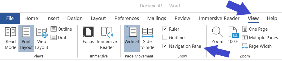 Top arrow points to the View tab on the ribbon (selected). The bottom arrow points to the Navigation Pane checkbox. It is just above “Show” – the name of the group.
- Go to the View tab (Alt, W).
- Go to the “Show” group. It has 3 check boxes: ruler, gridlines, navigation pane.
- Select the checkbox for navigation pane (or Alt, K).
Review Navigation Pane Contents
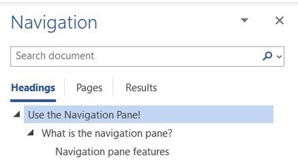
Expanded headings have a triangle pointing down beside them. This shows there is one heading level lower than them in the document.
The navigation pane lists headings contained in your document. Review:
- Are all items in the pane supposed to be headings? If regular text then change to “normal” style. Need help? Check out the Working with Styles module on the Office of Accessibility website.
- Are you missing any headings? If so, apply the appropriate heading style to the text.
- Do the headings use the correct heading level? The 2nd level headings are indented compared to the 1st level headings. The 3rd level headings are further indented.
- If you are looking for something in the document will the headings help you find it? If not, consider editing the heading text to support understanding.
Bonus: Navigate Using the Navigation Pane
You can travel to different sections of your document using the navigation pane.
Option 1: Use your mouse to select one of the headings.
Option 2: Use F6 until focus is in the navigation pane. Use your arrow key to move to the heading you want to go to, then enter to select.
Focus moves to that section of your document.
|