 Ligatures: Benefits and Pitfalls
Accessibility Considerations for Designing with Ligatures in InDesign and Illustrator
By Jeremy DePew, Senior Designer at Minnesota IT Services
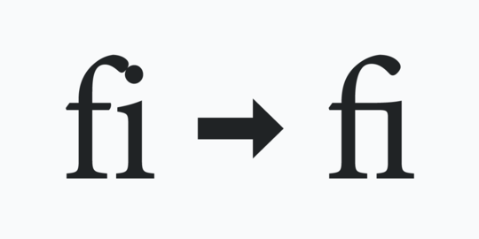
Anyone who creates documents or uses graphic design software has probably encountered a typographic feature called ligatures. A common feature in OpenType fonts, ligatures are replacement characters for certain letter pairs, such as fi, fl, ff, ffi, ffl, etc. They can improve the appearance of characters that have features that visually collide when used next to each other. In the example above, the letters “f” and “i” display as distinctly separate characters (left), as well as in ligature form (right).
In the example where the characters are distinctly separate, the dot of the letter “i” awkwardly bumps into the ascender (top) of the letter “f.” In the ligature example:
- the two letters have joined crossbars,
- the dot of the “i” is missing, and
- the ascender of the letter “f” travels over the letter “i.”
You may not consciously think about ligatures as you type, since you can select characters individuals and spell checkers don’t flag them as misspellings. However, there are some accessibility considerations that you should think about when you use them as you design documents, graphics, or websites.
This article will give a high-level overview of problems ligatures can cause, as well as provide some workarounds for solving those issues. These observations and suggestions are for Adobe InDesign and Adobe Illustrator, two common applications used by graphic designers.
Dive into ligatures, readability, and more in Ligatures: Benefits and Pitfalls.
Tech Tip: LinkedIn Feature Update and Logo Tech Tip
LinkedIn recently sent an announcement out to some users. It discussed the feature roll out for Dark mode. This is great news for anyone that benefits from this type of display option. This may include people with migraines, some vision disabilities, and other issues. You can learn more about how to use Dark mode in LinkedIn’s help article Switch Between Dark and Light Mode.
The email announcement included information for page administrators. It recommends that they check their logo as this could impact the way an organization’s logo appears.
Here’s how the Minnesota IT Services logo appears in Dark mode, for a recent post, when viewed on an Android device:
Need information about images viewed with different color themes and modes? Check out last month’s article: Plan, Design, Code with Color Themes in Mind.
|