|
Electronic information accessibility tips, tricks and trainings. June 2019, Issue VI
 Color can really enhance a design, but do not rely on color alone to convey meaning. People who are colorblind or have low vision will miss your message.
You can still use color to highlight or differentiate items, just be sure to include a secondary way people can get the same information.
Example 1
Add a pattern like stripes or dots to your charts and graphs to help ensure your audience can read your data.
 Example 2
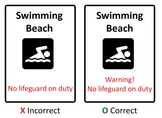
Red text is sometimes used to indicate an important warning. However, if you can't see red, then the message is lost. Simply add a word like "Warning!" so that all audiences get the message.
 Example 3
Highlighting text with color is okay. Just add a symbol, like an asterisk, so the text is highlighted for everyone.
 A good rule of thumb: Test your item in back and white or greyscale. If you are missing the message, then you need to add an additional element.

Select the Right Style for your Document Headline
Word Tip of the Month
|
Use the Heading 1 (H1) style instead of the Title style for the headline of your document.
Why? The Title style does not code as a heading. Instead it codes as regular body text. Without your headline being coded as an H1, the screen reader user won't know what text is supposed to be your document headline.
Another tip? The Heading 1 style should only be used for your document headline. Use Heading 2, Heading 3, etc. for any subheads in your document.
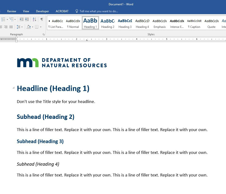 The accessible, branded Word templates on your computer guide you towards using the Heading 1 style for your document headlines and Heading 2, Heading 3, etc. for any subheadings.

When creating a form, you might be tempted to include placeholder text. After all, it seems like a great way to provide a helpful hint. However, when it comes to accessibility and usability, placeholder text creates several problems.
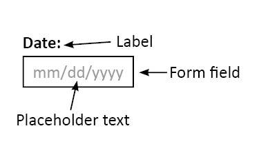
Placeholders disappear after you enter your info.
- If placeholder text contains crucial information like labels or instructions, that information is lost once the user enters anything into the form field. This makes it hard for people to check their work.
- It also tests short-term memory as you try to remember what the placeholder text said. Many people get distracted while filling out a form and need return to it later.
- People who use the keyboard to move from field to field don't usually stop to read the next form field before tabbing to it. Once they land in the form field, it is too late.
- Some placeholder text doesn't disappear. Instead, you are required to manually select and delete it. This is annoying and not any better than having it disappear.
Placeholders fail the color contrast test.
- Placeholder text is usually light grey. Depending on the background, this light colored text can fail the color contrast ratio requirement of at least 4.5:1.
Not all screen readers read placeholders.
- If the screen reader can't read it, then users will miss the information.
Placeholders can be confusing.
- People can mistake placeholder text for pre-populated text and will try to submit the form without entering their specific information.
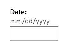
Instead of placeholders, position labels and hints outside of the form field so they are always visible to the user.
Incorrect:
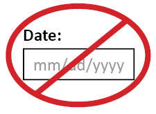 Correct:
 Looking for more details?
Resources
Upcoming Trainings
Training options and details
Electronic Information Accessibility Intranet Page
Go-to location for resources, guidance and information.
Designees
Need assistance? Contact your division Electronic Information Accessibility (EIA) Designee.
|