Public information disseminated online must be accessible for everyone - including people with disabilities. The Americans with Disabilities Act mandates that all people have equal access to all programs, services and activities, including document accessibility.
Outlined below are a few “first steps” in the process of making sure documents are accessible in Microsoft Word. This is a multi- layered process, so these tips do NOT cover all aspects of accessibility, nor do they cover PDF accessibility.
-
Use sans serif font, size 12: sans serif fonts are fonts without accent marks on the ends of letters. Serif fonts can be difficult for some people to see and look blurry with magnifying software.
- Example sans-serif fonts: Helvetica, Arial, Tahoma, Calibri, and Century Gothic.
-
Make hyperlinks accessible by using clear descriptive text that describes the link’s destination, rather than just providing the URL or using “click here”.
Example:
-
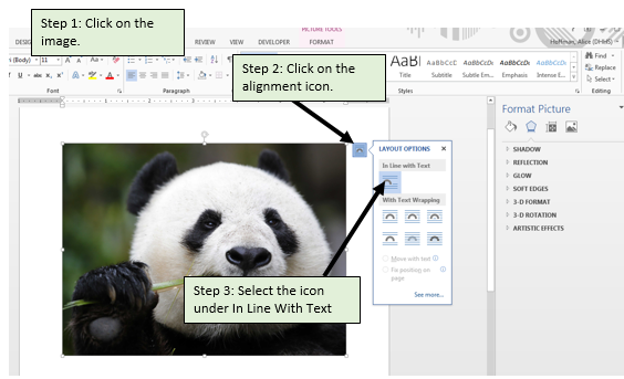
Make sure all non-text elements are in-line with text: In order for a screen reader to understand where in the order of page content an image falls, it needs to be in-line with text. This can be done using the text wrapping option menu, as shown below.

-
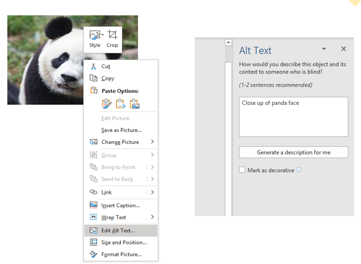
Make sure all non-text elements have alt text: alternate text provides a description of all non-text elements. This allows screen reader users to understand what is on the page, even if they cannot see it. This is done using the “Edit Alt Text” option when you right click on the image, as shown below. The alt text should provide any details and description that someone not using a screen reader would get looking at the image.

-
Use color appropriately: while color is an important tool in communication and design, it must be used appropriately. Not all individuals can see color, and some individuals have difficultly differentiating between two colors when the contrast is not high enough. Here are a few basic guidelines for color:
- All background should be clear and single colored. Avoid using gradients or images in the background. The necessary color contrast between text and background is 1:4.5. You can use an online color contrast checker to confirm that you have appropriate contrast.
- Never use color as the only means of conveying information. You should be able to print your document in black and white and still understand the information.
- Avoid grayscale in all elements.
-
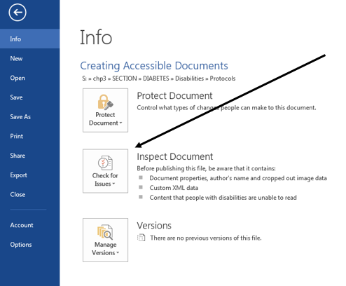
Double check your work with the Microsoft Accessibility Checker: Microsoft programs on PC computers all have an Accessibility Checker. This won’t catch all errors, but it is a good double check for things like alt text and alignment. This can be found under the File à Info window.
