UPDATE: A new look for CGA
U.S. Coast Guard sent this bulletin at 04/06/2018 01:07 PM EDT
A new look for CGA
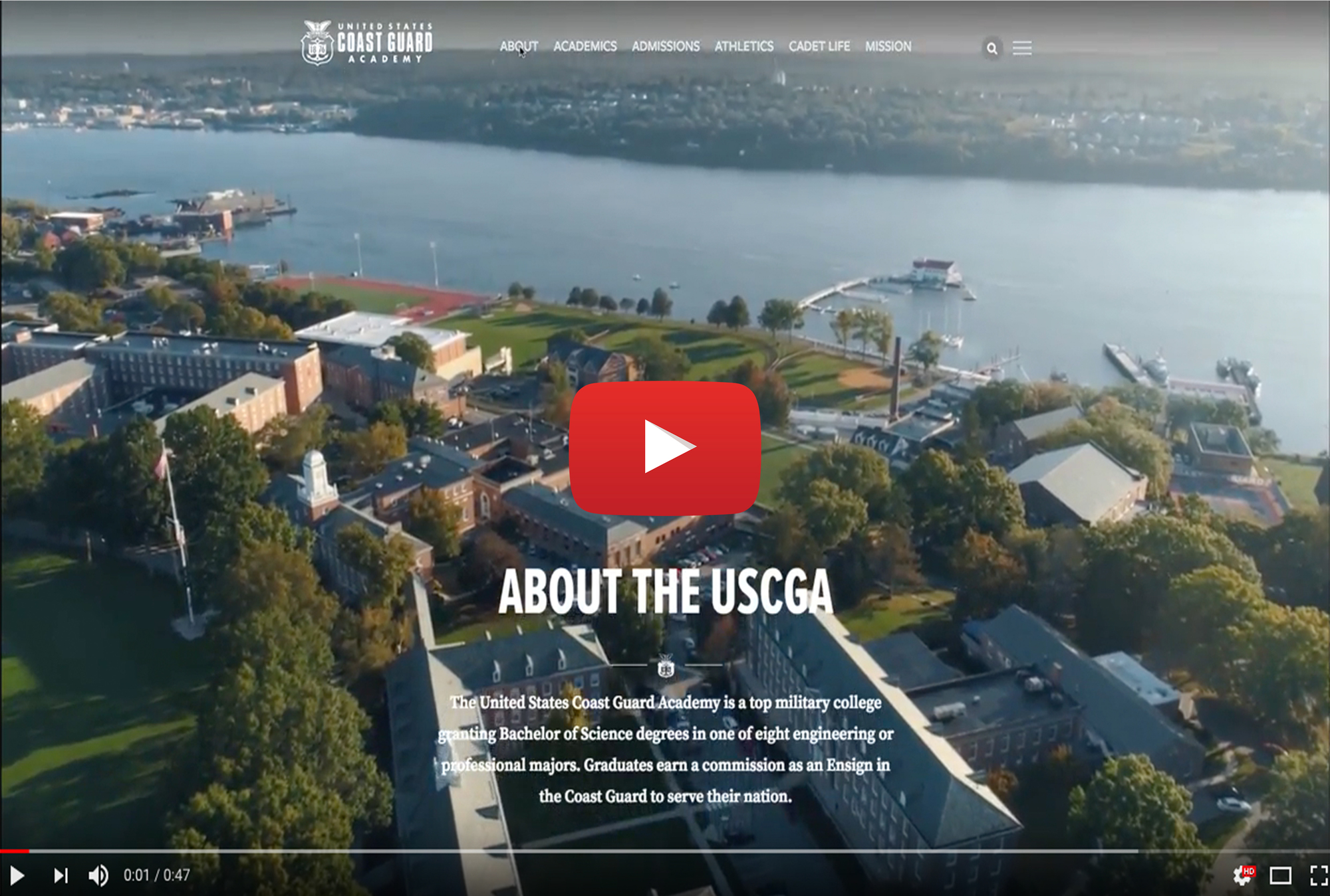
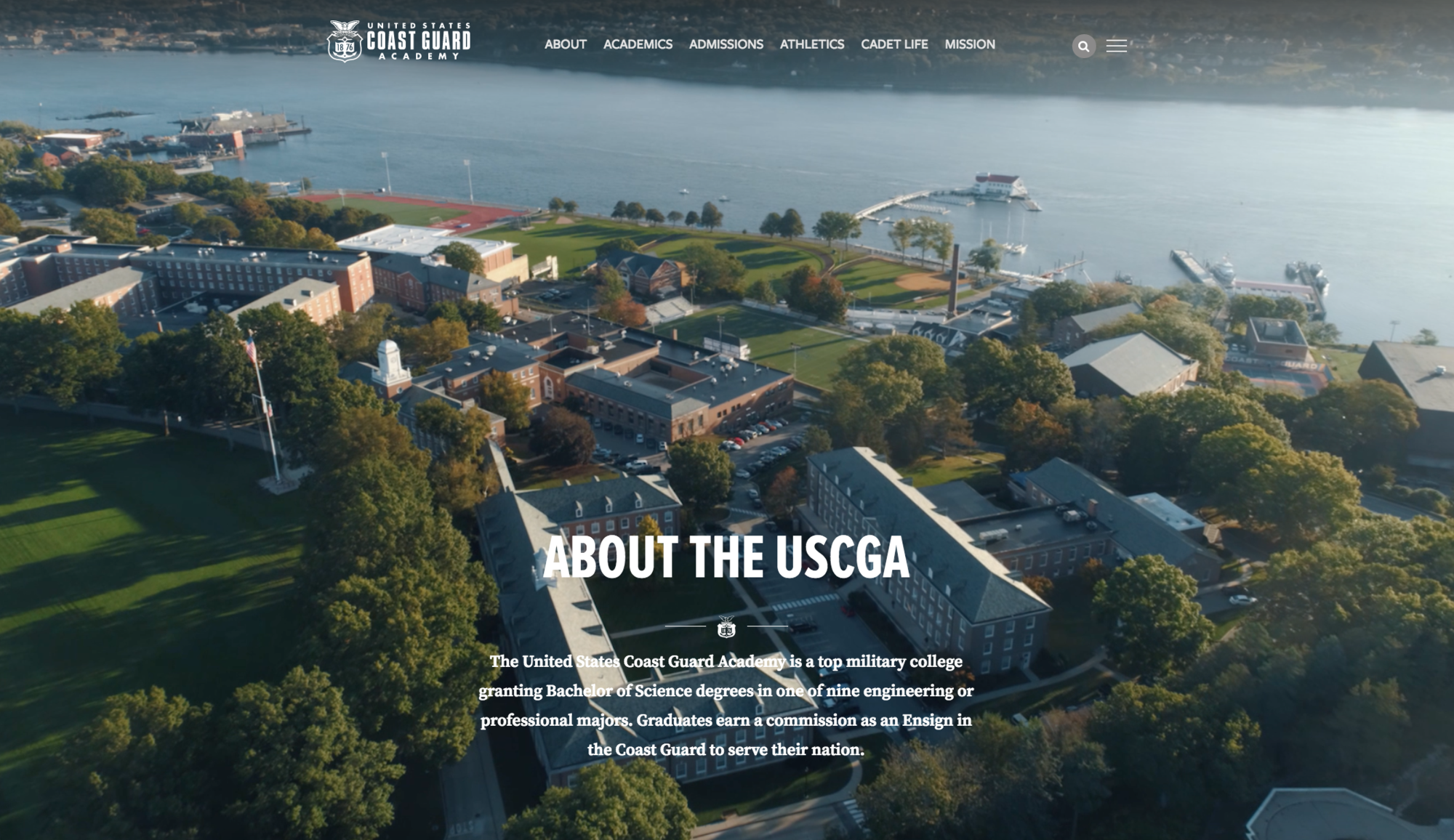
The U.S. Coast Guard Academy refreshes its brand by updating its website and logo
NEW LONDON, Conn. -- The U.S. Coast Guard Academy is announcing a complete redesign of it’s external website www.uscga.edu and a refresh of the institution’s visual standard.
The efforts are designed to improve the communication experience for students and those who use mobile devices to access information about the Academy.
The Academy’s existing logo was adopted in 2003, before the widespread use of digital media. Academy officials note that the new logo is a simpler design that will be easier to reproduce and render digitally.
The Academy’s website was designed in 2004 and was last updated in 2011. The latest redesign effort involved a team of staff, faculty and military members in a two-year effort to expand content and better differentiate the Academy.
“Our intent is to offer a sophisticated, interactive experience that will help us meet students where they are, illustrate the benefits of attending the Academy, as well as challenges and rewards of service as a commissioned officer in the Coast Guard,” said Associate Director of Admissions for Marketing Sue Bibeau. “Our new site will offer a clean look with more dynamic images and videos,” she said. “It will allow us to expand our message on this incredibly important platform, and should better meet the needs of today’s college bound students.”
Academy personnel worked with the marketing firm Paskill, Stapleton and Lord, based in Glenside, Pennsylvania to complete both products.
-USCG-


