|
|
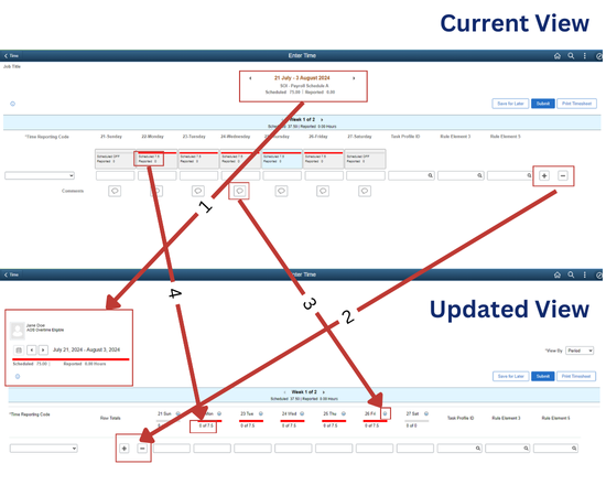
Effective July 29, you will notice four key updates. Please review this summary of the changes along with screenshots of the current and new timesheet views for reference.
- The position of the start and end dates for the pay period will be shifted from the top center to the top left corner.
- To enhance usability, the option to add or delete rows will be conveniently moved to the second column from the left, eliminating the need to scroll to the far right.
- Additional options for adding and viewing comments will be available.
- “Scheduled” and “Reported” time won’t be stacked; instead, the time summary will be displayed. Click on the icon next to the date for additional options, including add/view comments.
Use the screenshots below to preview the changes.
 If you have any questions about entering your pay, please reach out to your agency payroll team.
|
|
|
|