
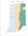


Esri has created a series of interactive maps to visualize the changes in US population and state apportionment following the release of 2020 Census Apportionment Results earlier this week. The maps contrast anemic population growth in the Northeast and the Midwest with rapid gains in many Western and Southern states, and show how the balance of power among states has shifted as a result. Together, these maps tell a clear story about how and where the US population is changing and growing. Article

Indiana Geographic Information Office - NEWS
Indiana Office of Technology sent this bulletin at 05/13/2021 01:01 PM EDT
|